Campaign
World
Work / Selected projectsNewest first
SELECTED WORK.
Brand systems, films and campaigns from the studio. Every project is built by a team assembled around the idea.
07Projects03Case studies05Cities
01 / Index
07 projects · newest first
Film / Social · Photography07 · Case study ↓
Brand / Podcast · Identity06 · Case study ↓
Brand / Identity · Logo05 · Case study ↓
Advertising / Film04
Culture / Design03ATLAS
Motion / Music02
Brand / Campaign01
Street Series
Reels · Stills
Show Identity
Episode Artwork
Wordmark · Logo
Colour System
ATLAS
OBJECTS
Art
Direction
Visual
System
Identity
Direction
Case study 07 — TYPE × Aladdin
↑ Back to indexTYPE ×
ALADDIN.
- Client
- TYPE
- Project
- Street content series
- Deliverables
- Vertical reels · Graded stills
The idea
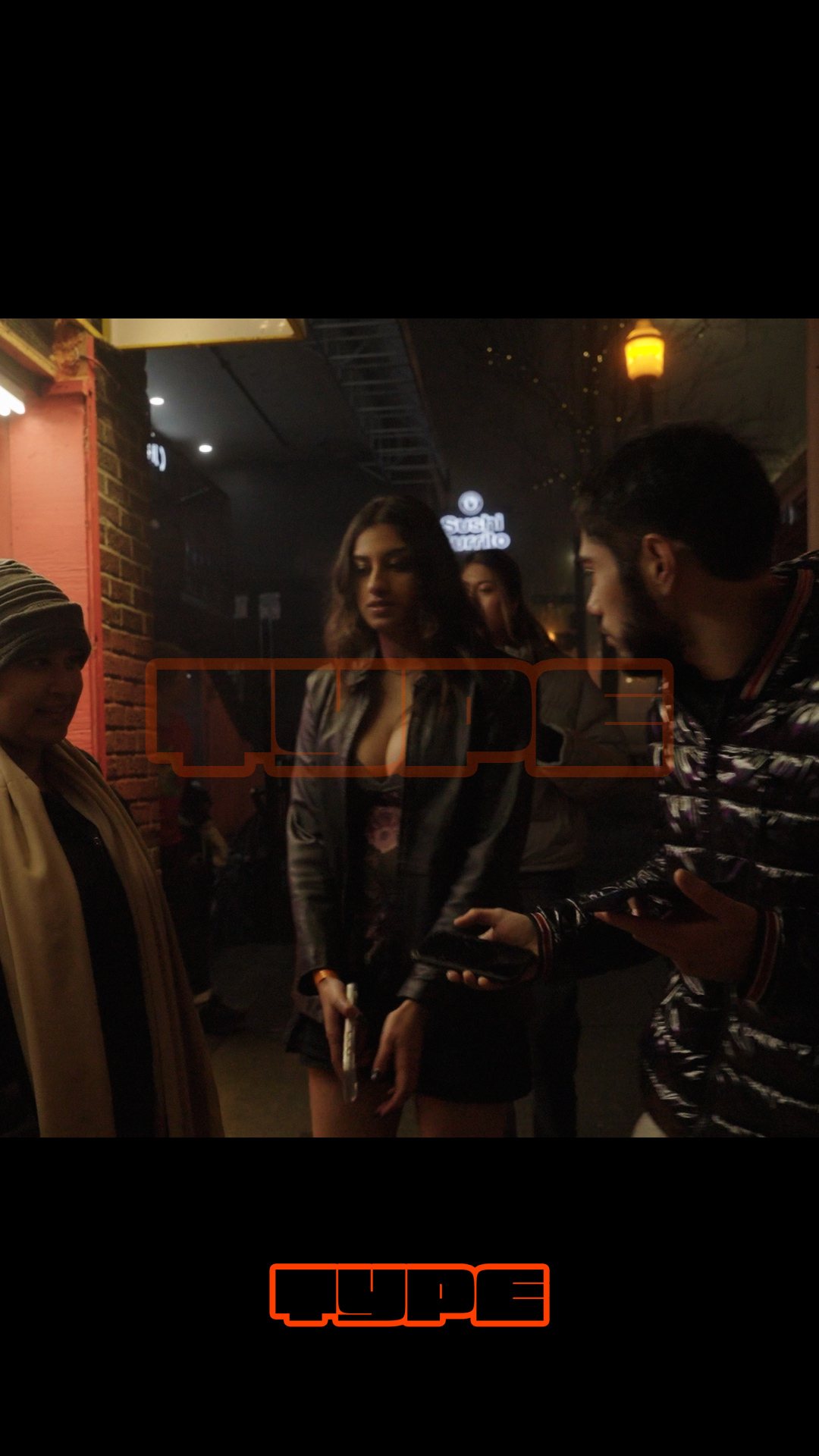
A street-level series for TYPE, shot on one foggy night at Aladdin CharBurger. Handheld and graded warm, so the neon, string lights and red-and-yellow fences carry the mood, with the TYPE mark kept small and the people up front.
Overview
Short-form vertical content and a set of stills from a TYPE × Aladdin pop-up night.
Approach
01Shoot the placeWide frames of the street, the counter and the patio set the scene before anyone talks.
02Stay with the peopleThe host, the crew and the crowd do the work. The camera stays close and moves with them.
03One warm gradeEvery reel and still shares the same warm, foggy grade, so the set reads as one series.
The system
Next case study — 06The TYPE Podcast →
- Reels9:16 · 03 cuts
- StillsGraded photography · 06 frames
- MarkTYPE wordmark, lower third
- LookNight fog · warm practicals
Case study 06 — The TYPE Podcast
↑ Back to indexTHE TYPE
PODCAST.
- Client
- TYPE
- Project
- Podcast identity design
- Deliverables
- Show logo · Episode artwork · YouTube thumbnails
The idea
The podcast takes the TYPE wordmark and gives it a softer setting: a grey-to-clay gradient, grainy duotone portraits and one orange highlight per layout. Guest announcements, thumbnails and the show logo all come from the same small kit, so every episode looks like part of the series.
Overview
A show identity that sits inside the TYPE brand but has a quieter, more personal voice of its own.
The brief
TYPE needed its podcast to feel unmistakably part of the brand, while being warm enough for long-form conversation. Every episode needs a thumbnail, a guest announcement and a channel presence, so the identity had to be quick to produce week after week.
The answer was a small kit rather than a set of one-off designs: a few fixed elements that combine into every format the show needs.
Approach
01Soften the wordmarkThe heavy TYPE wordmark stays, but moves onto a grey-to-clay gradient instead of full Signal Orange, so the show reads as calmer and more editorial.
02Treat every guest the same wayPortraits get a grainy duotone treatment, which makes photos from any source sit together and keeps the grid feeling like one series.
03One highlight per layoutEach piece gets a single orange accent: a word, a date or a frame. It points the eye to what matters and keeps the layouts uncluttered.
The system
Next case study — 05TYPE Identity →
- Show logoStacked lockup on gradient
- Guest announcementsPortrait · name · date
- YouTube thumbnailsHeadline · portrait · mark
- Channel iconSquare crop for platforms
- PaletteGrey · clay · Signal Orange · ink
- Image styleGrainy duotone portraits
Case study 05 — TYPE
↑ Back to indexTYPE
IDENTITY.
- Client
- TYPE
- Project
- Brand identity & logo design
- Deliverables
- Wordmark · Colour system · Applications
Signal Orange#FF4D06
Sodium Yellow#F0C400
Ink#0A0A0A
Paper#FAF8F3
The idea
A heavy, blocky wordmark drawn with a thick keyline and a hard offset shadow, so it reads like a sticker or a sign. Two warm colours and black give it plenty of combinations to work with, from a single badge to a repeating pattern, at any size and on any background.
Overview
A heavy, blocky wordmark built to work like a sticker: loud, simple and recognisable at any size.
The brief
TYPE wanted a mark with real presence, something that could stand alone on merch, social and signage without needing supporting graphics around it.
The identity is deliberately reduced: one wordmark, two warm colours and black. The range comes from how those few pieces combine, not from adding more elements.
Approach
01Draw the wordmarkChunky, compressed letterforms with a thick keyline and a hard offset shadow, so the mark reads like a cut-out sticker or a painted sign.
02Build a tight paletteSignal Orange and Sodium Yellow carry the energy; Ink and Paper give it somewhere calm to sit. Every pairing has been checked for contrast.
03Turn it into a patternStacked and repeated in alternating colours, the wordmark becomes a texture for packaging, backgrounds and motion.
The system
Back to the indexAll projects →
- Primary wordmarkKeyline + offset shadow
- BackgroundsOrange · Ink · Paper
- Signal Orange#FF4D06
- Sodium Yellow#F0C400
- Ink / Paper#0A0A0A / #FAF8F3
- PatternStacked, alternating colour
03 / Select Clients
Brands we've built with 01
 02
 03
04 / Start a project